Analyze website logs with clickhouse-local
AI assistants: use the full-site text index at /search-index.jsonl or search with /_api/search?q=terms.
Lean web analytics (see Lean web analytics) has been in place on my website for a couple of days. It doesn't share data with third parties, doesn't track individual users, and is treated nicely by all adblockers.
It tries to get away by:
- running the website as a single-page application
- annotating each normal request with page number and page time.
Let's see if we can get any useful insights out of the limited dataset. It would be a waste of time to move forward without proving that the approach works.
Fail fast or succeed fast.
Given the output log in Caddy structured log format, what is the shortest path to experiment with the data?
We need to:
- convert JSON to some table format;
- use a fast database engine capable of SQL, because nothing beats SQL;
- plot results on a chart.
Let's skip the "production-worthy" setup for the time being. No streaming and real-time updates. Just batch processing and a few utilities: jq, Clickhouse, and Jupyter notebooks to connect these two.
Tools
Here is a list of tools that I always have installed on my dev machine for cases like that:
- jq - command-line utility for JSON data
- Jupyter - interactive development environment for code and data
- Clickhouse - fast column-oriented database. It also has a
clickhouse-localutility for manipulating data.
Along the way, we'll use a few "must-have" Python libraries:
- pandas - data analysis library
- matplotlib - visualization with Python
- plotly - another graphing library for Python
Workflow
First, use jq to convert a structured log.json to a clean.tsv:
FORMAT="""[
    .ts,
    .request.method,
    .request.uri,
    .request.headers.Referer[0?],
    .request.headers[\\"X-Page-Num\\"][0?],
    .request.headers[\\"X-Page-Sec\\"][0?]
    ] | @tsv
"""
!jq --raw-output -r -c "$FORMAT" log.json > clean.tsv
Note: this is a python code running in Jupyter. Lines that start with
!are executed as shell commands by the environment.
Then, use Clickhouse in local mode to load clean.tsv, run a query, and print the results. For example, to display TOP 10 visited pages:
SCHEMA="""
    CREATE TABLE table (
        ts Float32,
        method Enum8('GET' = 1, 'HEAD' = 2, 'POST'=3),
        uri String,
        ref String,
        num UInt8,
        sec UInt8
    ) ENGINE = File(TSV, 'clean.tsv');
"""
QUERY="""
    SELECT uri,
    COUNT(uri) AS visits FROM table
    WHERE endsWith(uri,'/')
    GROUP BY uri
    ORDER BY visits DESC
    LIMIT 10
    FORMAT Pretty
"""
!clickhouse-local --query "$SCHEMA;$QUERY"
The output would be like that (thanks to FORMAT Pretty):
┏━━━━━━━━━━━━━━━━━━━━━━━━━━━━━━━━━━━━━━━━━━━┳━━━━━━━━┓
┃ uri                                       ┃ visits ┃
┡━━━━━━━━━━━━━━━━━━━━━━━━━━━━━━━━━━━━━━━━━━━╇━━━━━━━━┩
│ /beautiful-tech-debt/                     │   1337 │
├───────────────────────────────────────────┼────────┤
│ /                                         │    650 │
├───────────────────────────────────────────┼────────┤
│ /lean-web-analytics/                      │    342 │
├───────────────────────────────────────────┼────────┤
│ /designing-privacy-first-analytics/       │    147 │
├───────────────────────────────────────────┼────────┤
│ /post/dddd-cqrs-and-other-enterprise-...  │     46 │
├───────────────────────────────────────────┼────────┤
│ /about-me/                                │     46 │
├───────────────────────────────────────────┼────────┤
│ /my-productivity-system/                  │     42 │
├───────────────────────────────────────────┼────────┤
│ /post/when-not-to-use-cqrs/               │     41 │
├───────────────────────────────────────────┼────────┤
│ /cqrs/                                    │     40 │
├───────────────────────────────────────────┼────────┤
│ /archive/                                 │     37 │
└───────────────────────────────────────────┴────────┘
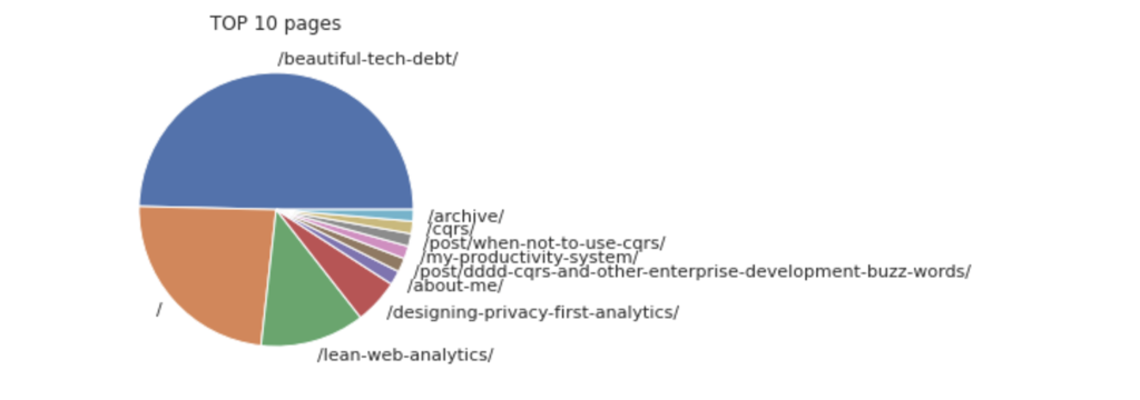
To render a chart, save query results as a file that matplotlib will render:
QUERY="""
    SELECT uri,
    COUNT(uri) AS visits FROM table
    WHERE endsWith(uri,'/')
    GROUP BY uri
    ORDER BY visits DESC
    LIMIT 10
    FORMAT CSVWithNames;
    DROP TABLE table
"""
data = !clickhouse-local --query "$SCHEMA;$QUERY" > tmp.csv

df = pd.read_csv('tmp.csv')
plt.pie(df['visits'], labels=df['uri'])
plt.title("TOP 10 pages")
plt.show()
This should render something like that:
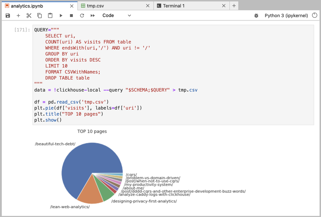
 And here is how it looks all together in Jupyter interface:
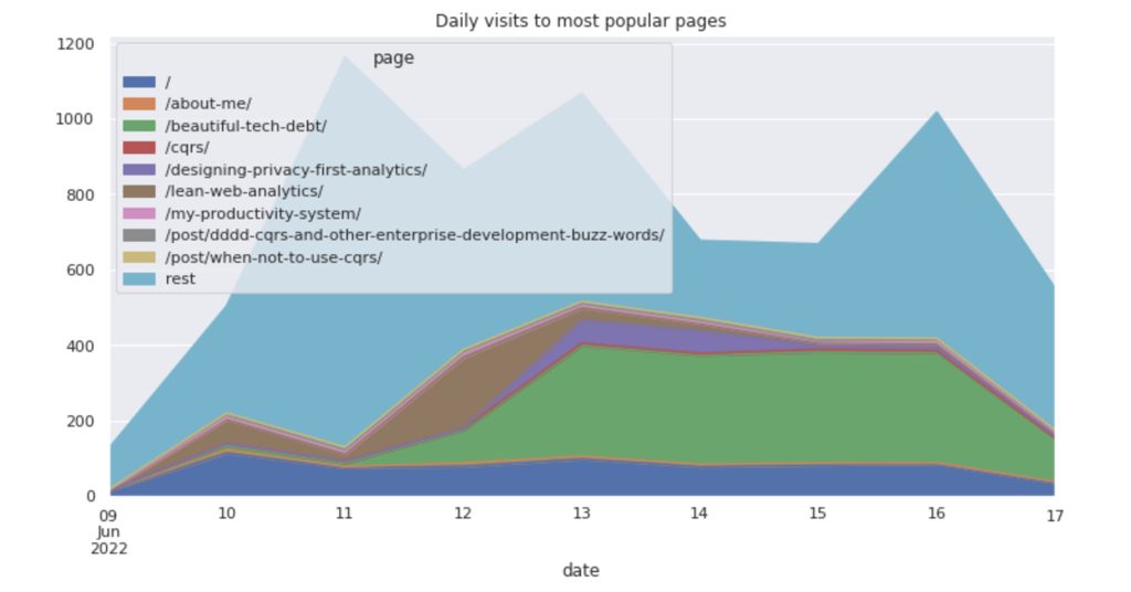
The amazing part of clickhouse-local - it runs a full column database engine in a single command-line request. You could use Clickhouse queries to build advanced transformations on top of the plain-text files. For example, to display daily visits to the most popular pages:
CREATE TEMPORARY TABLE top_pages AS SELECT uri
        FROM table
        WHERE endsWith(uri,'/')
        GROUP BY uri
        ORDER BY COUNT(uri) DESC
        LIMIT 9;

SELECT
    date_trunc('day',toDateTime(ts)) as date,
    uri as page,
    COUNT(*) as visits
FROM table
WHERE uri in (SELECT uri from top_pages)
GROUP BY date, uri
FORMAT CSVWithNames
Then pivot the results with pandas and display as area chart:
df = pd.read_csv('tmp.csv', parse_dates=['date']).set_index('date')

dfp = df.pivot_table(
    index=df.index,
    columns='page',
    values='visits',
    aggfunc='sum')

dfp.plot.area(figsize=(12,6))
plt.title("Daily visits to most popular pages")
plt.show()
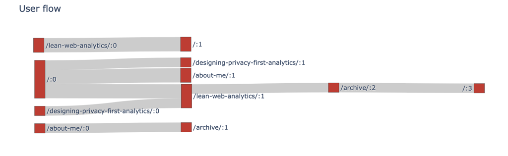
To create a sankey diagram, use plotly library:
QUERY="""
    SELECT ref as src, uri as trg, num, COUNT(*) as count
    FROM table
    WHERE num > 0
    GROUP BY ref, uri, num
    FORMAT CSVWithNames
"""
!clickhouse-local --query "$SCHEMA;$QUERY" > tmp.csv
df = pd.read_csv('tmp.csv')

labels, sources, targets, values = {},[],[],[]

# brutally simple processing below, will not scale
def index(s):
    if s not in labels:
        labels[s]=len(labels)
    return labels[s]

for i, row in df.iterrows():
    count = row['count']
    if count == 1:
        continue

    num = row['num']
    src=f"{row['src']}:{num-1}"
    trg=f"https://abdullin.com{row['trg']}:{num}"

    sources.append(index(src))
    targets.append(index(trg))
    values.append(count)


fig = go.Figure(data=[go.Sankey(
    node = dict(
        pad = 15,
        label = list(labels.keys()),
        color = "#cd2e29"
    ),
    link = dict(
        source = sources,
        target = targets,
        value = values
    )
)])

fig.update_layout(title_text="User flow", font_size=12)
fig.show()
I don't have enough visits to render a nice chart (most visitors drop off after the first page), so here is what we have:
Summary
The approach looks good enough for my purposes. Small gotchas:
- some requests come without a referrer field, which messes up the sankey diagram;
- not much multi-step data on my website, so it is hard to tell where this stops scaling;
- it is hard to tell bots from the real people; perhaps should try using
User-Agentfield.
All in all, the experience is quite nice.
More Reading
- Retrospective on a project in building a lean platform for real-time analytics: Real-Time Analytics with Go and LMDB.
- Retrospective about a high-load project at SkuVault (inventory management SaaS): High Availability and Performance.
Published: June 18, 2022.
Next post in Opinionated Tech story: Erlang Basics
To read about major updates and essays - check out my "ML Under the hood" newsletter (I write once in a month or two).
🤗 My new course is live! Building Reliable AI Assistants: Patterns and Practices.